In preparation for the 2016 edition of 36 Days of Type, I had only anticipated that I would be using dots/poitillism as part of the process. While I am less than an amateur in that field, I've always admired that method of illustration and lettering, and I was interested in experimenting with it, notably in how to convey contrast and depth through just the mere use of dots.
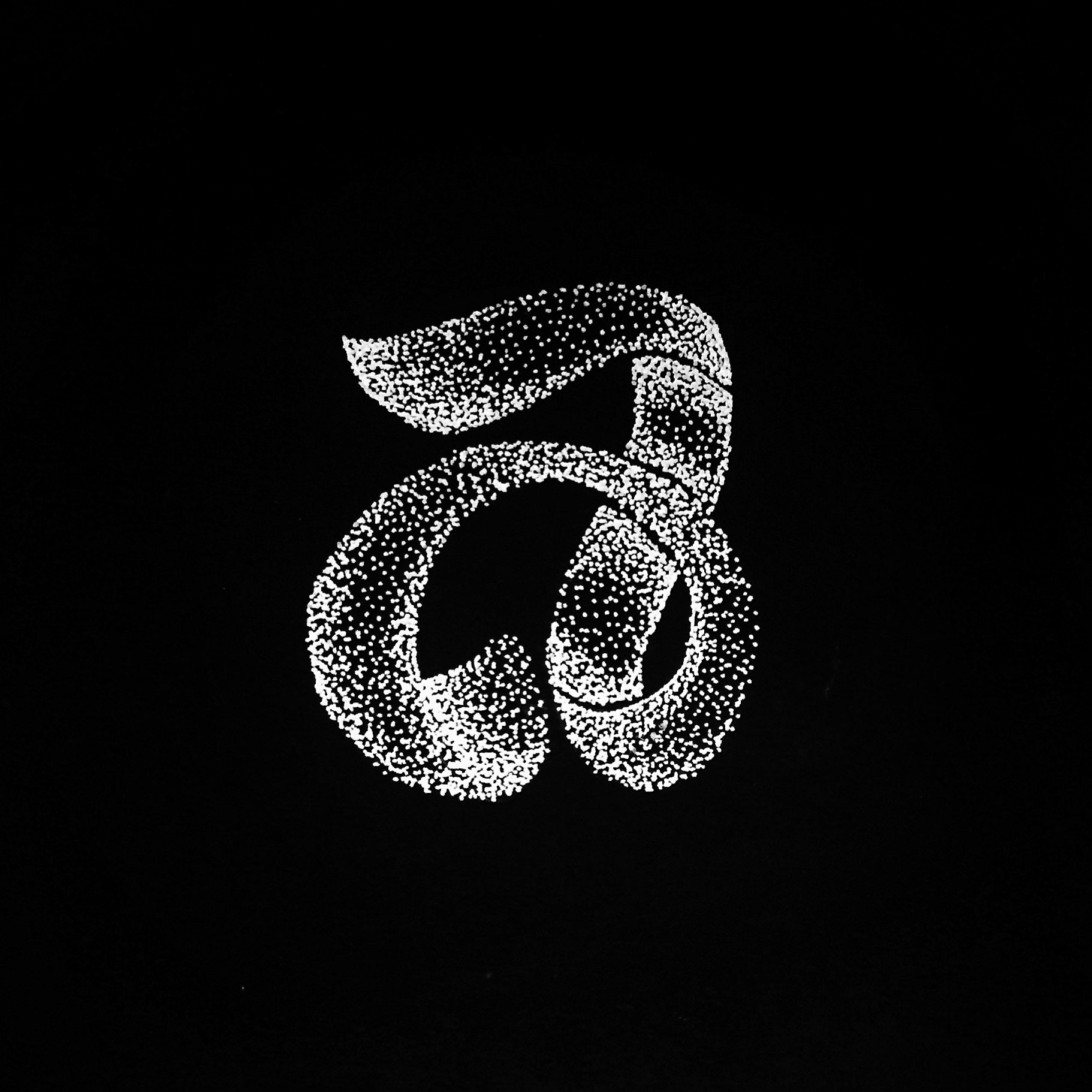
With the first letters of the project I found myself spending most of my time trying to create a recognizable letterform through pointillism, and consequently ran out of time to achieve a fully balanced design — I didn't have time to investigate colours, or any additional elements that might bring the dots to life.
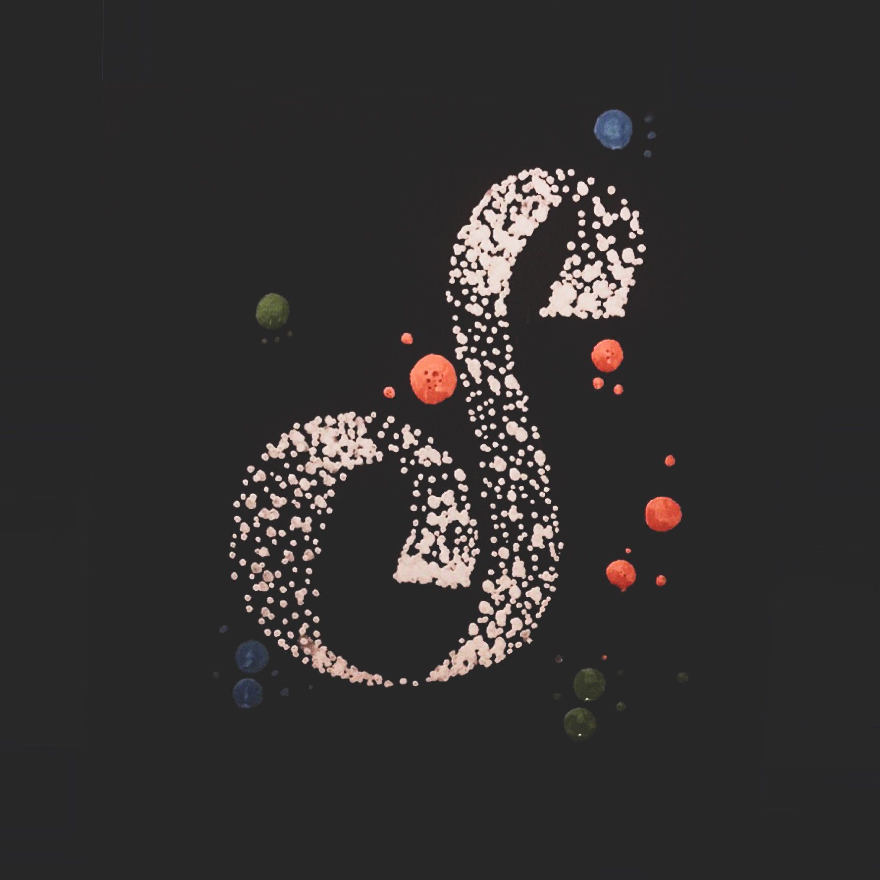
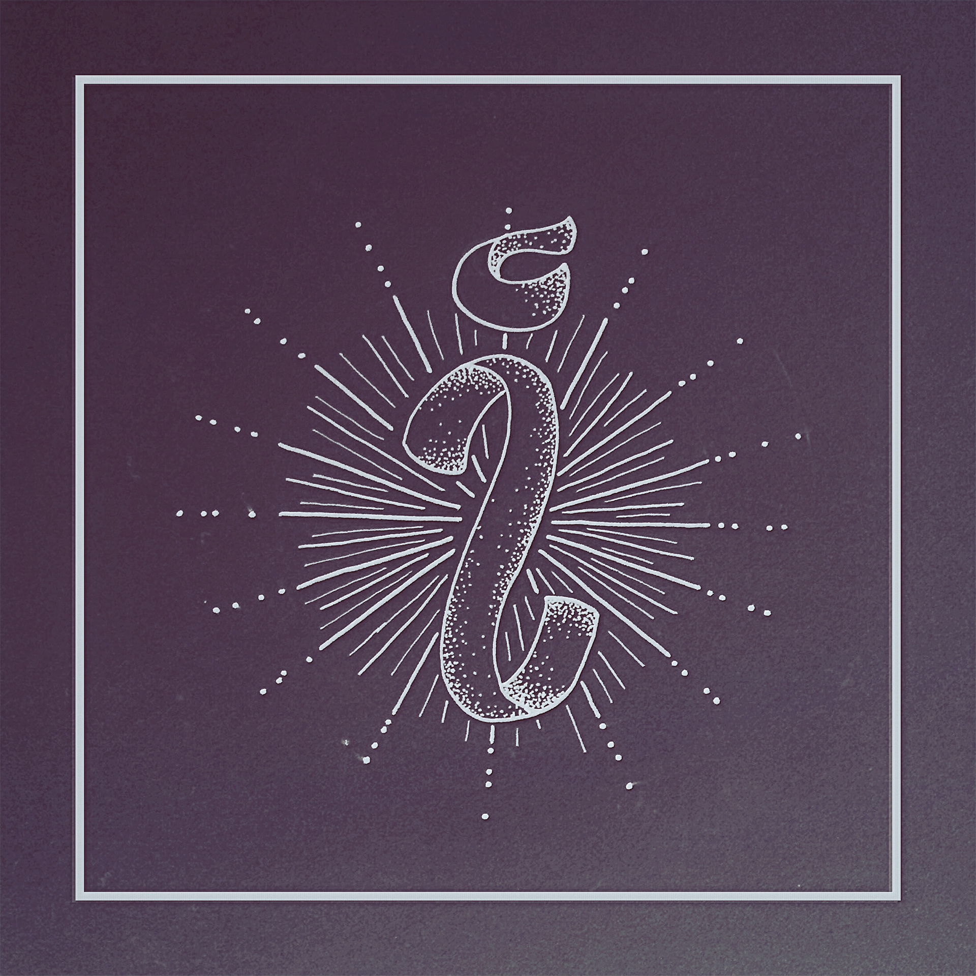
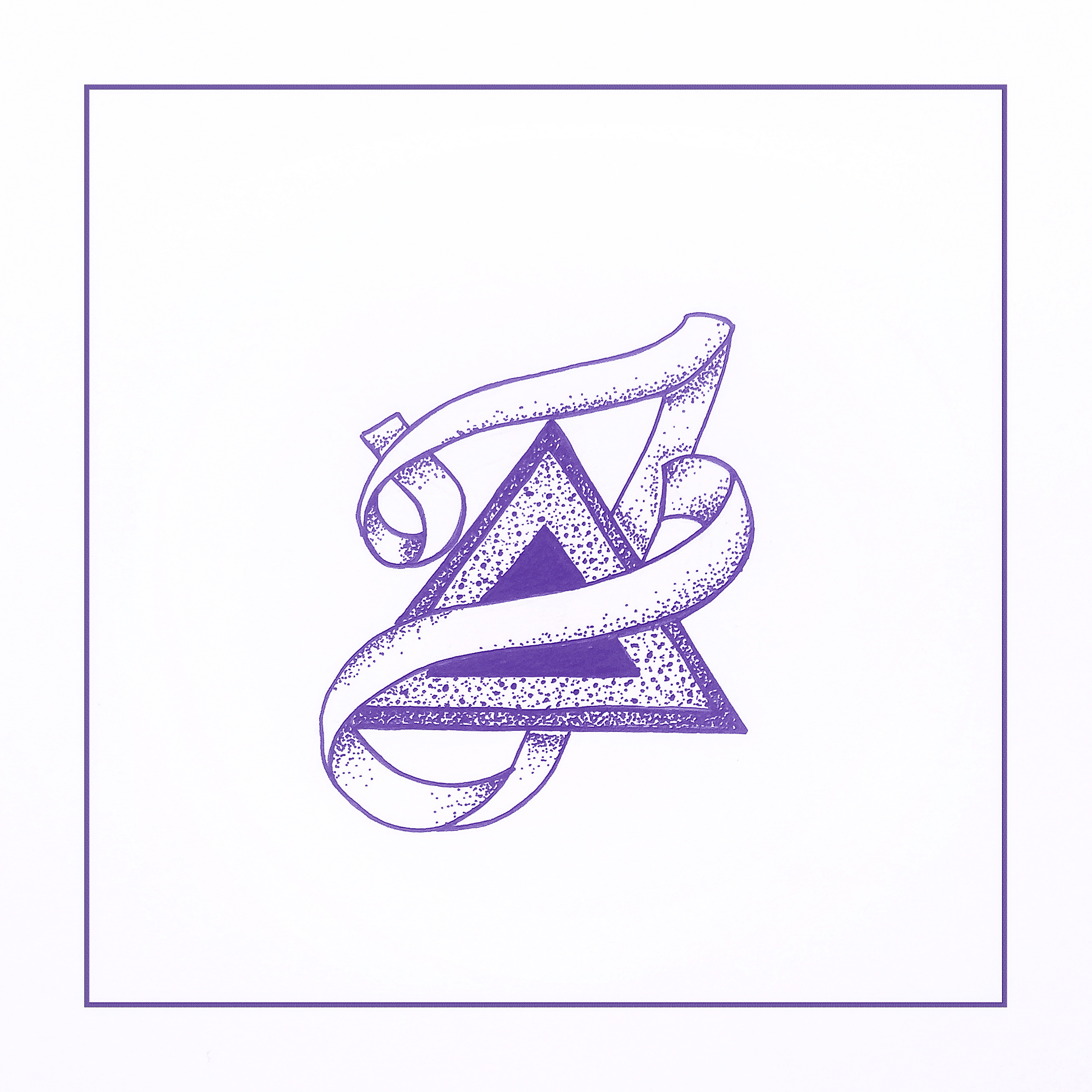
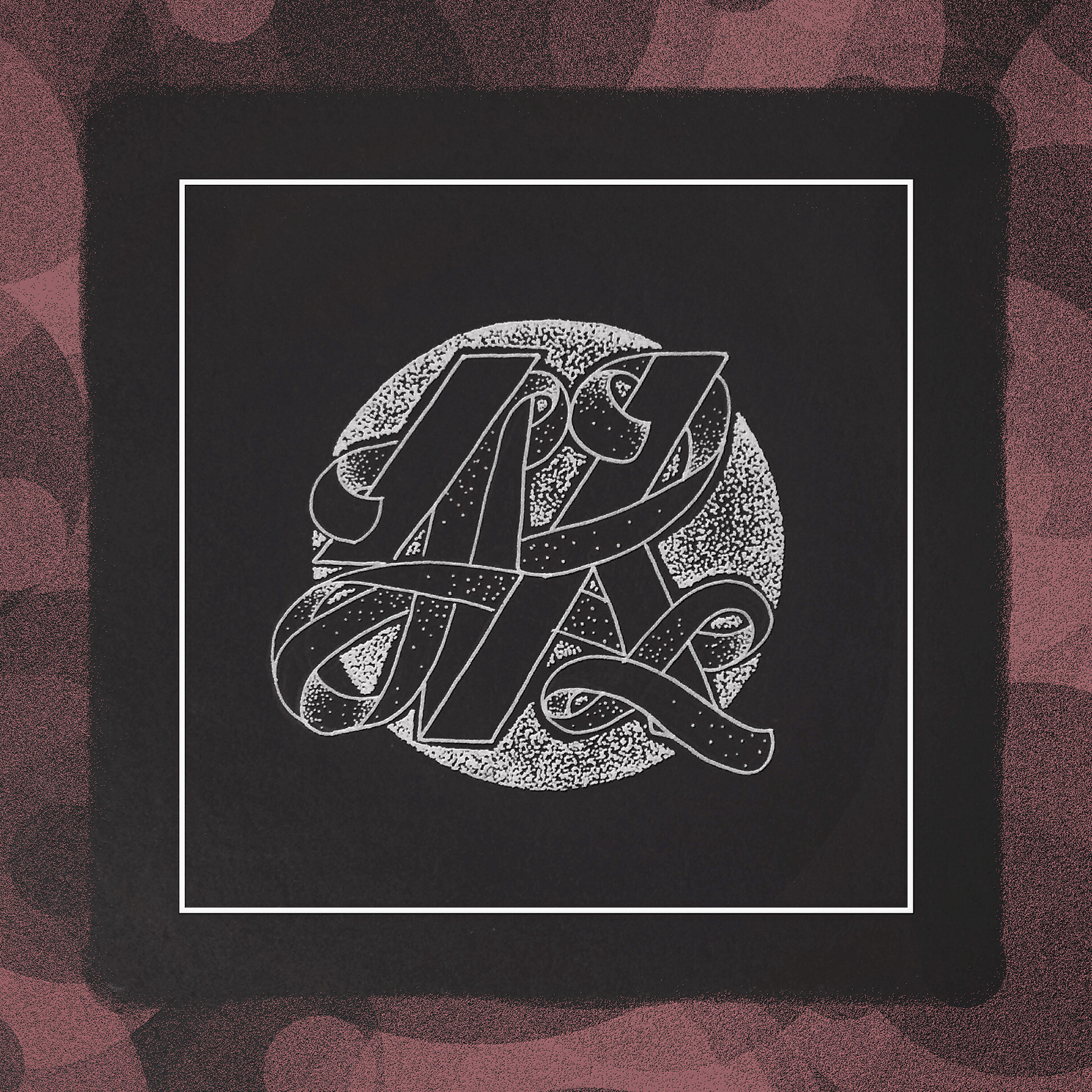
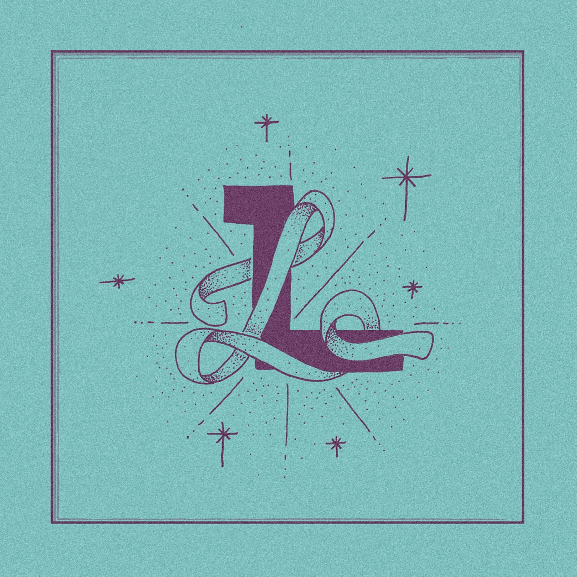
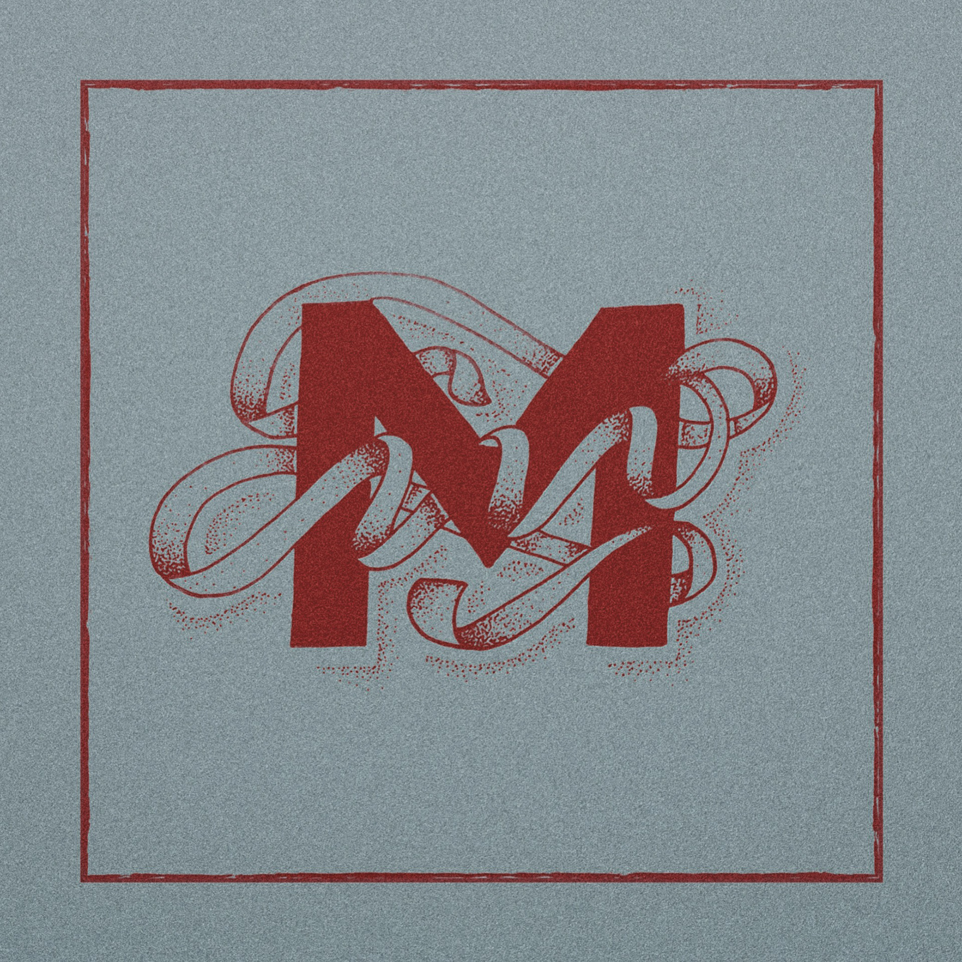
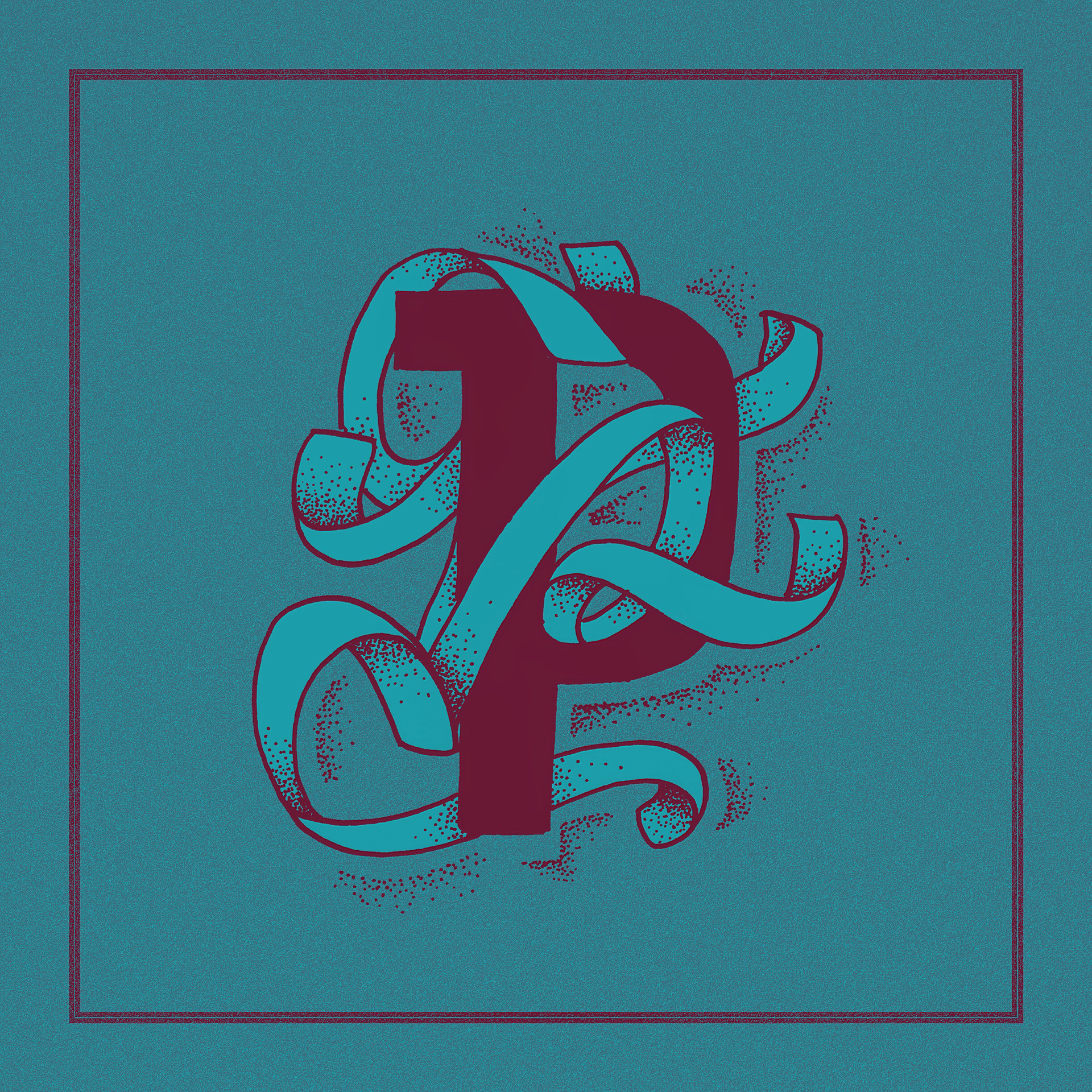
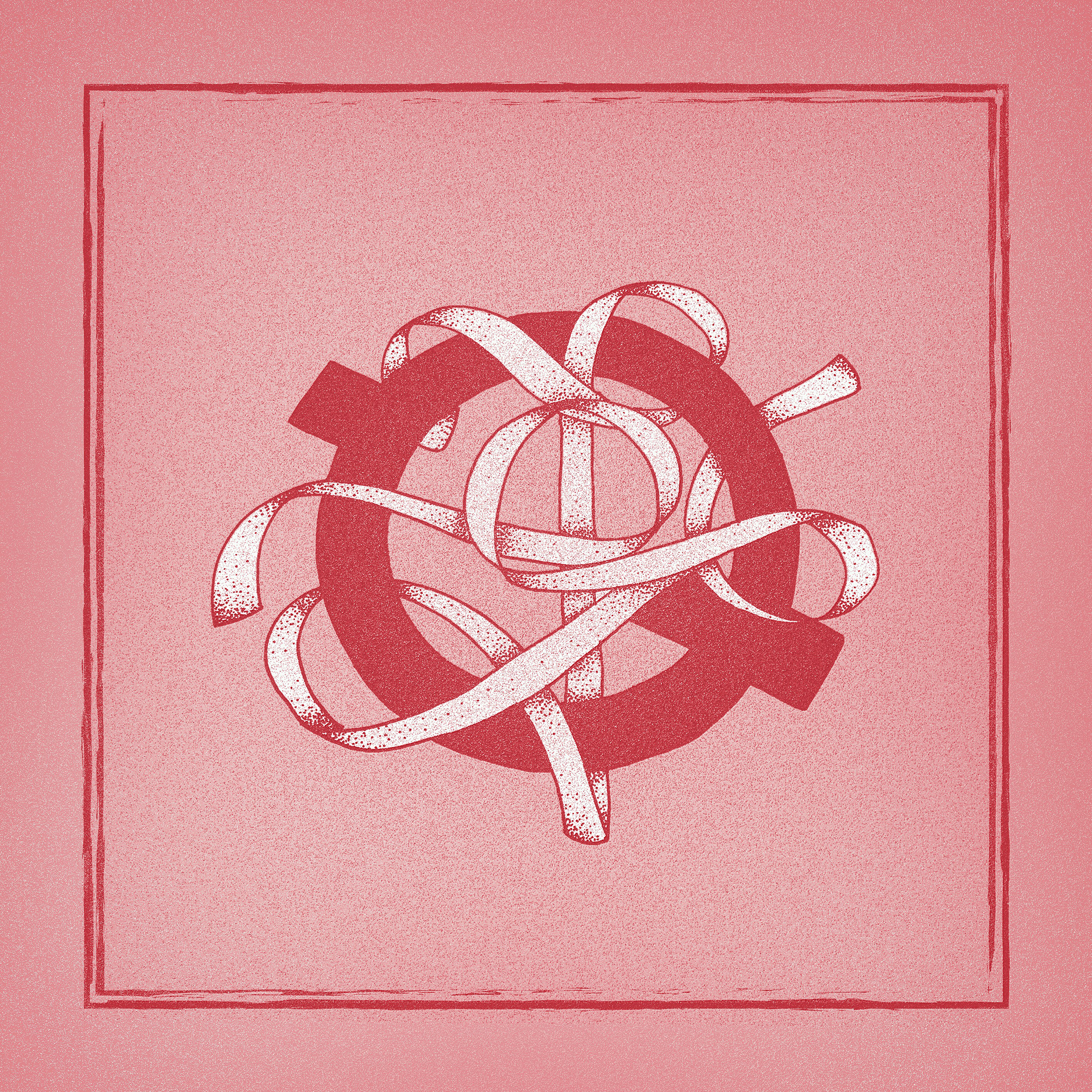
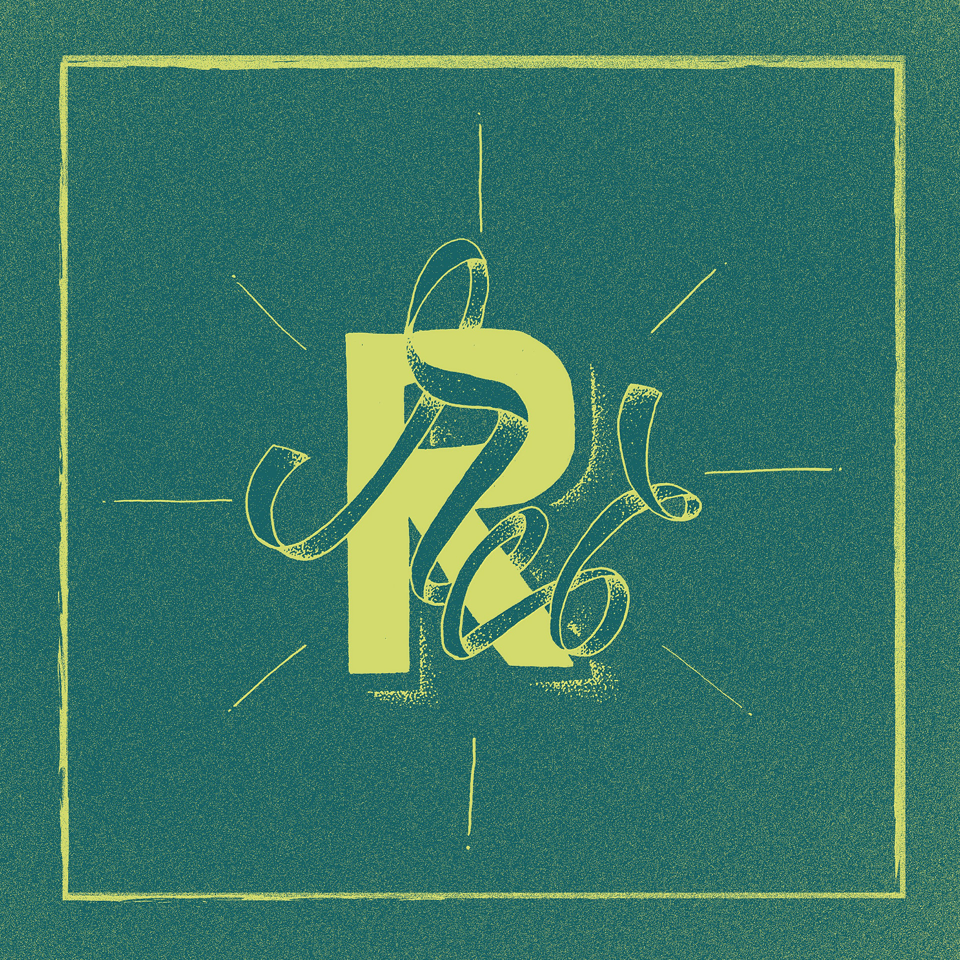
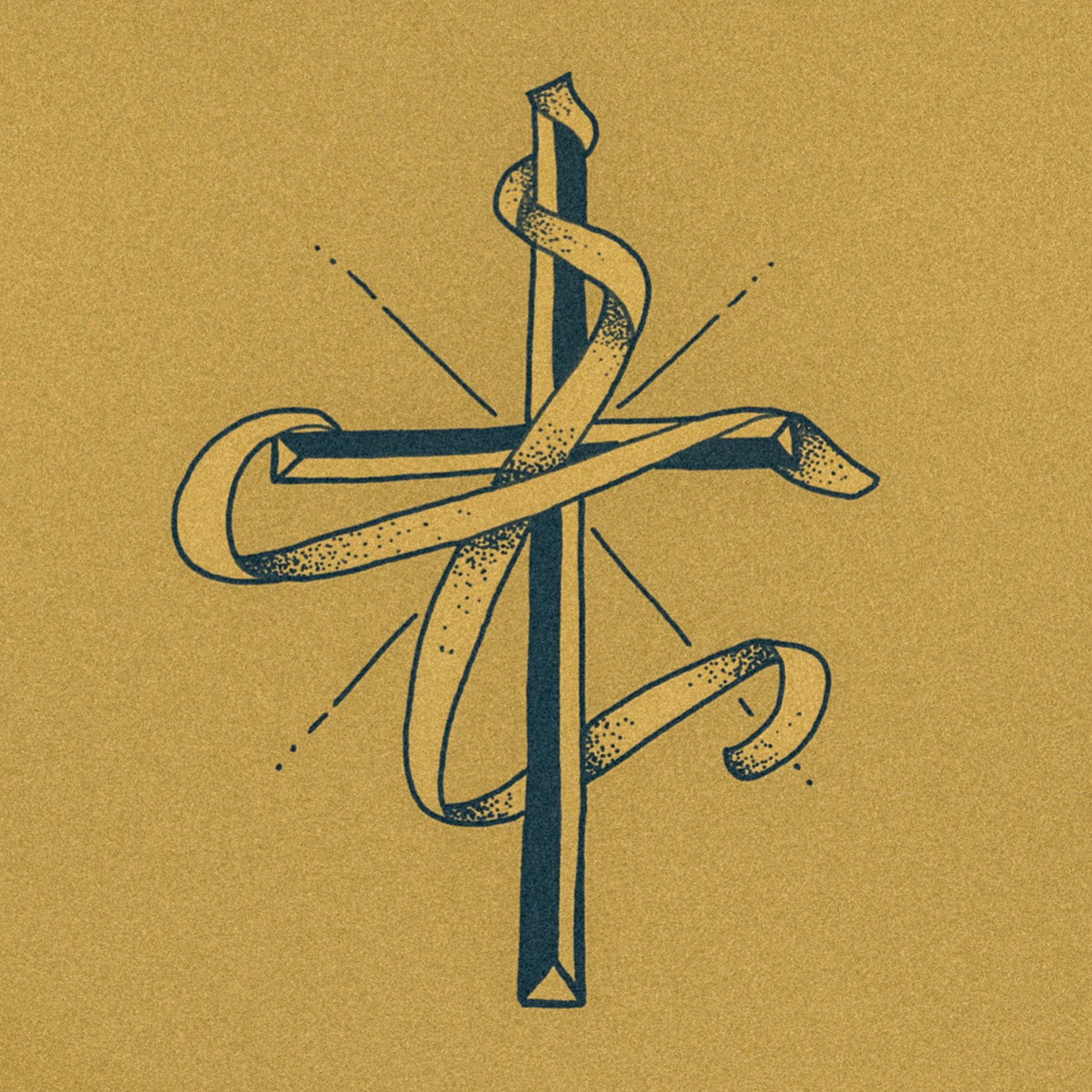
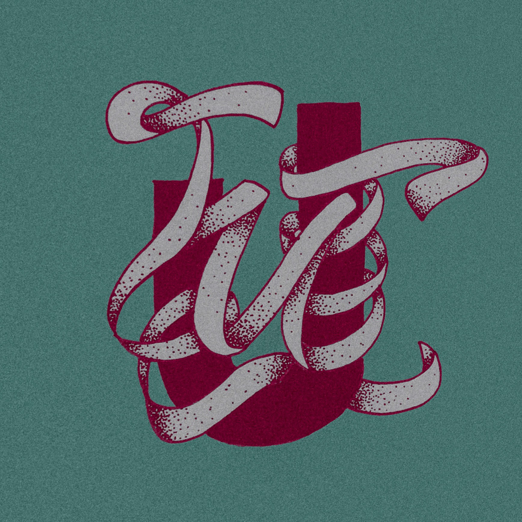
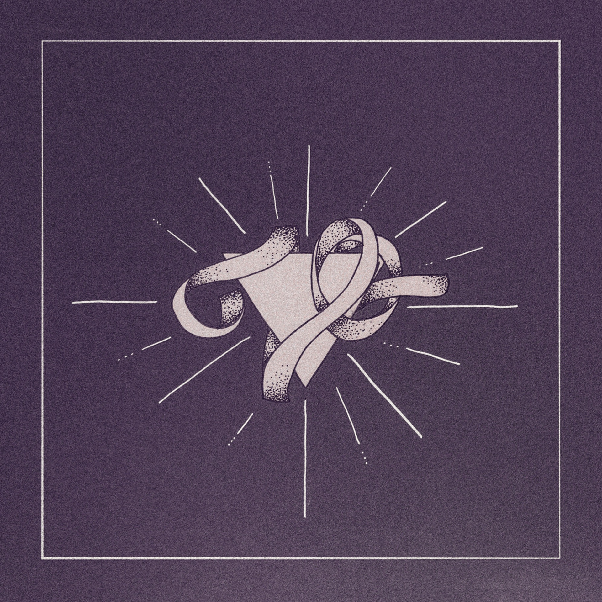
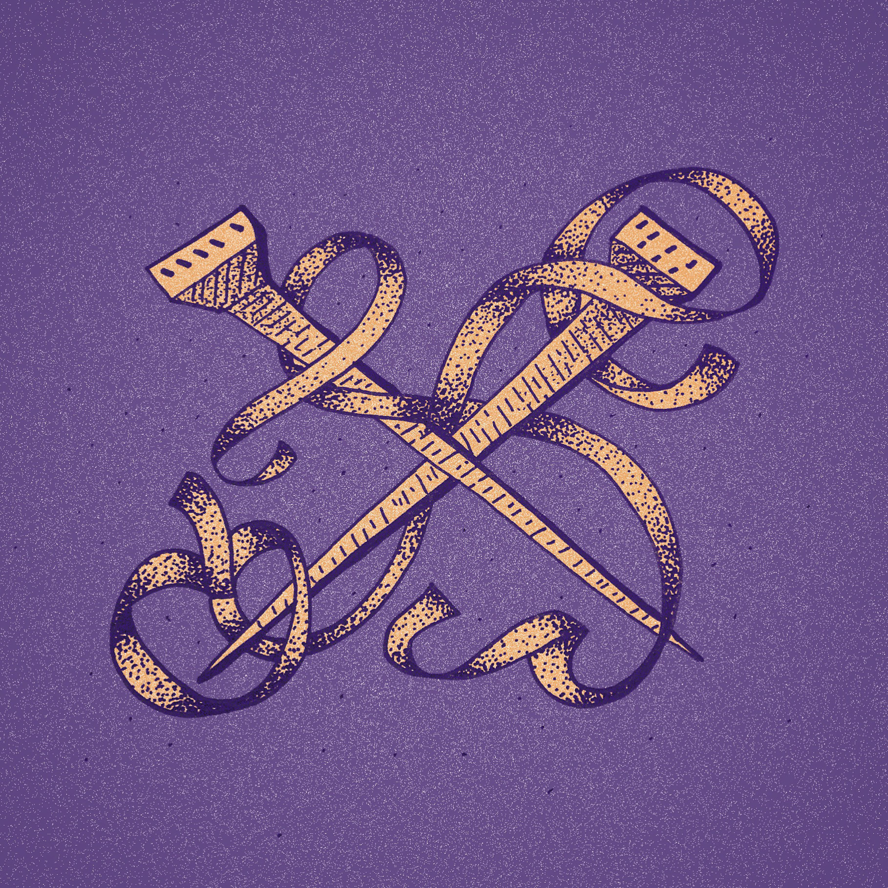
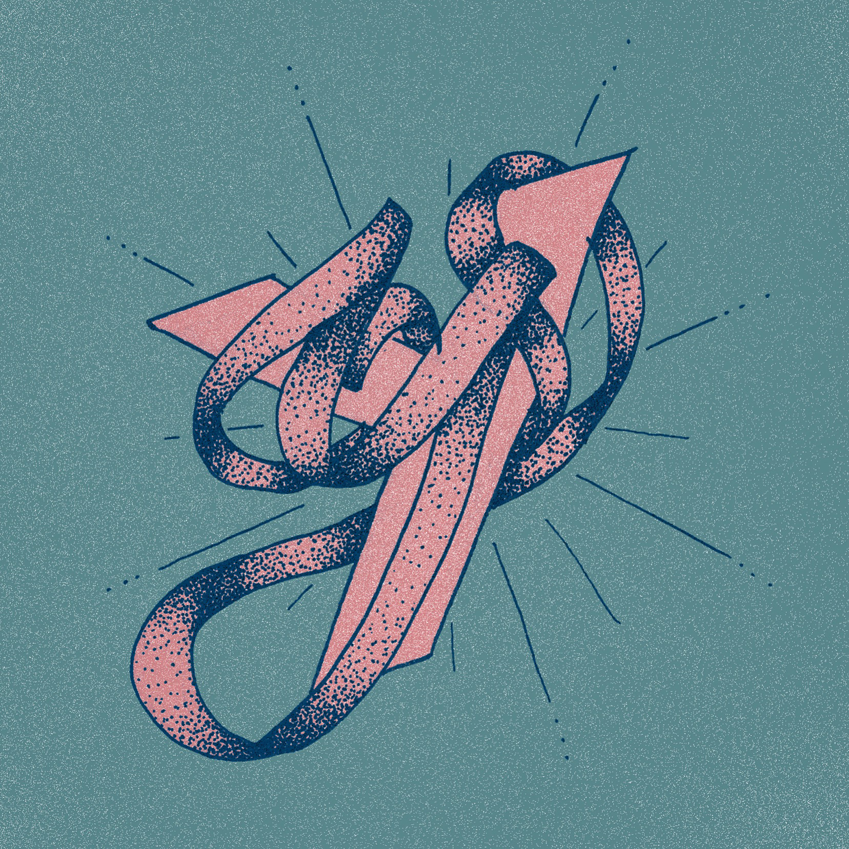
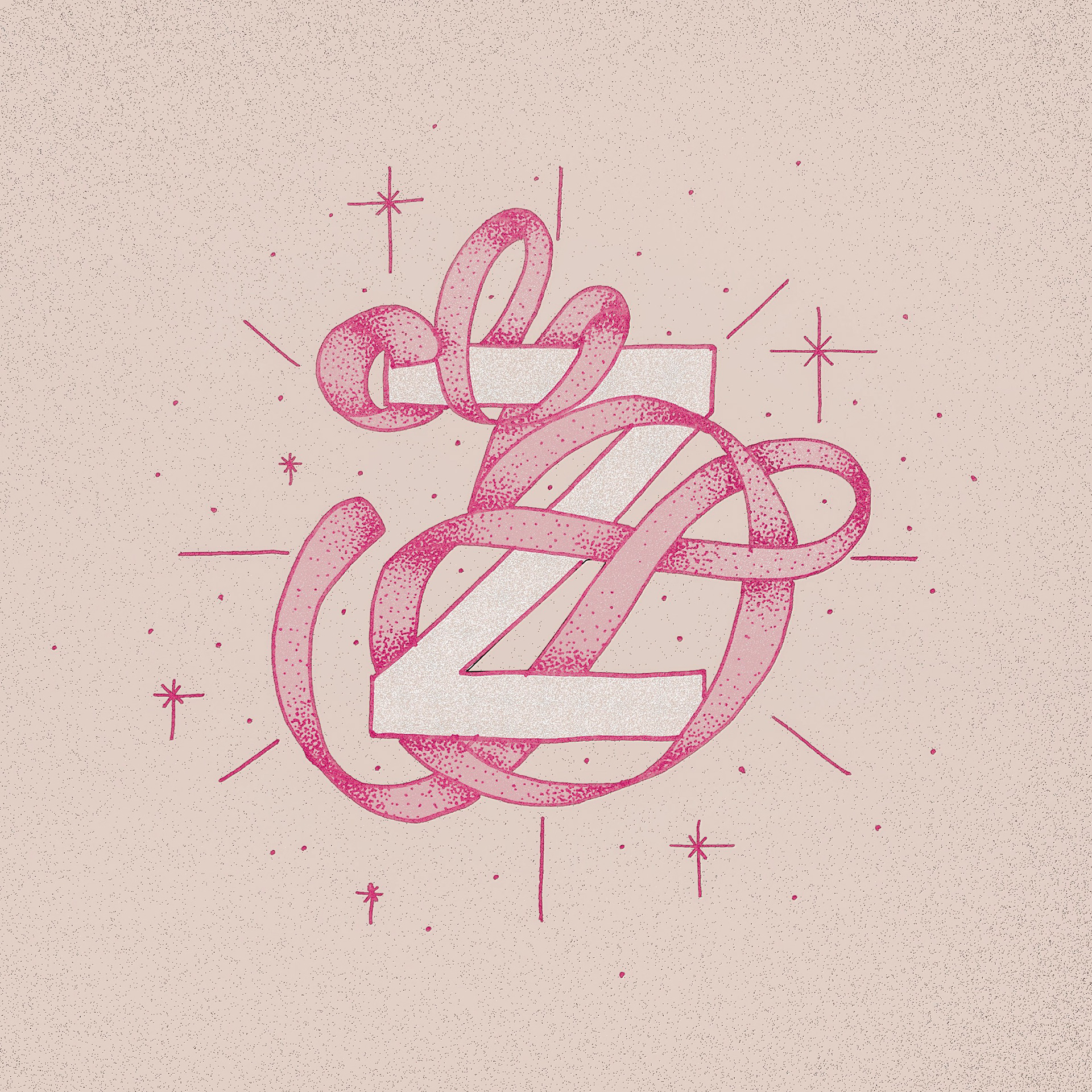
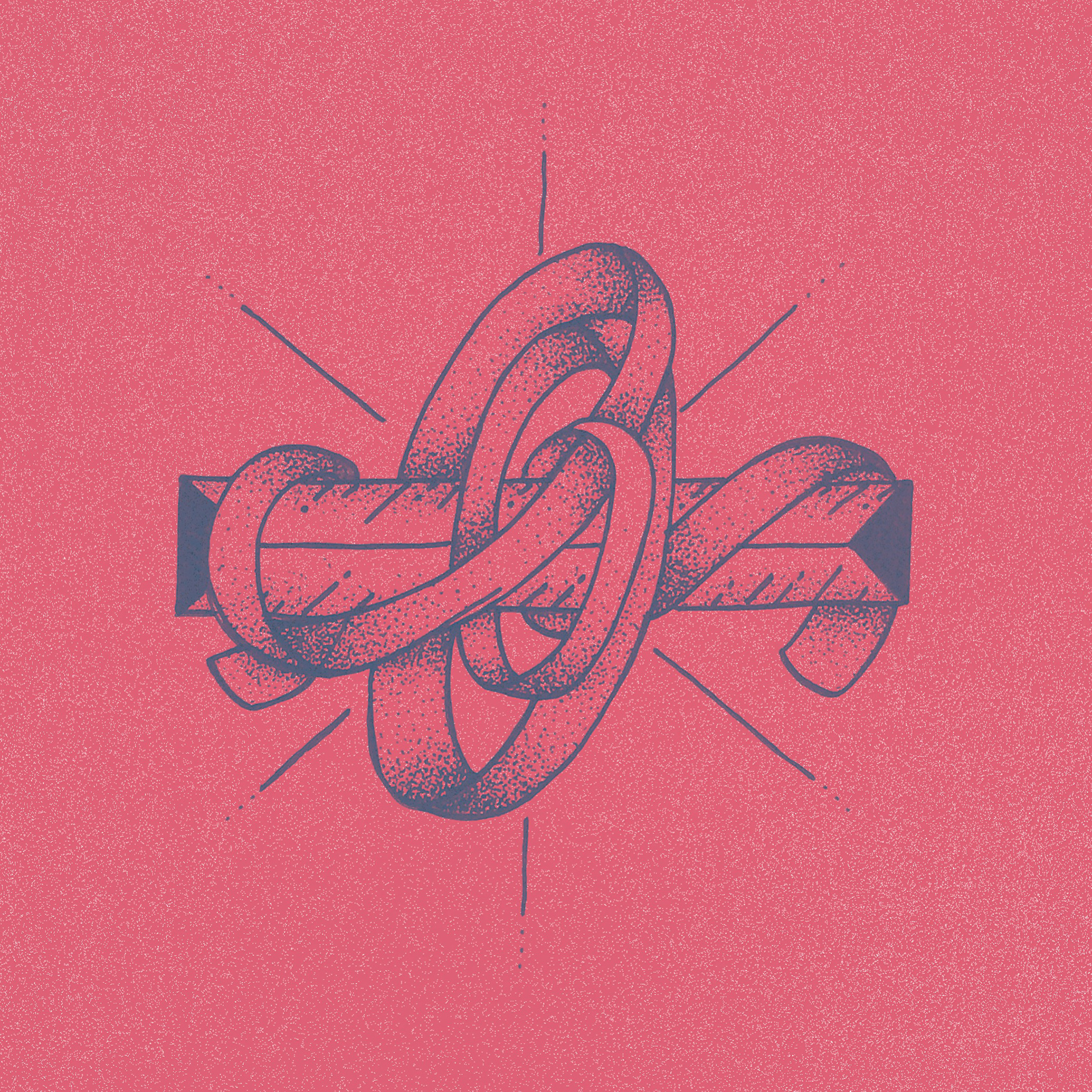
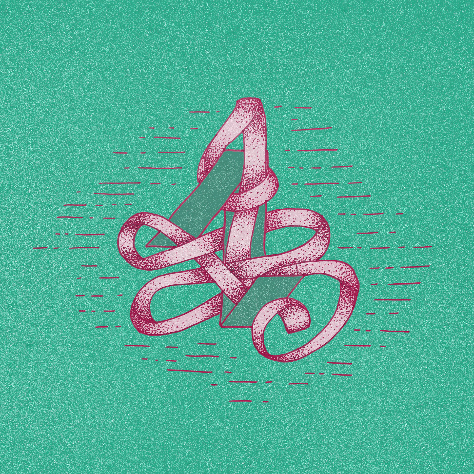
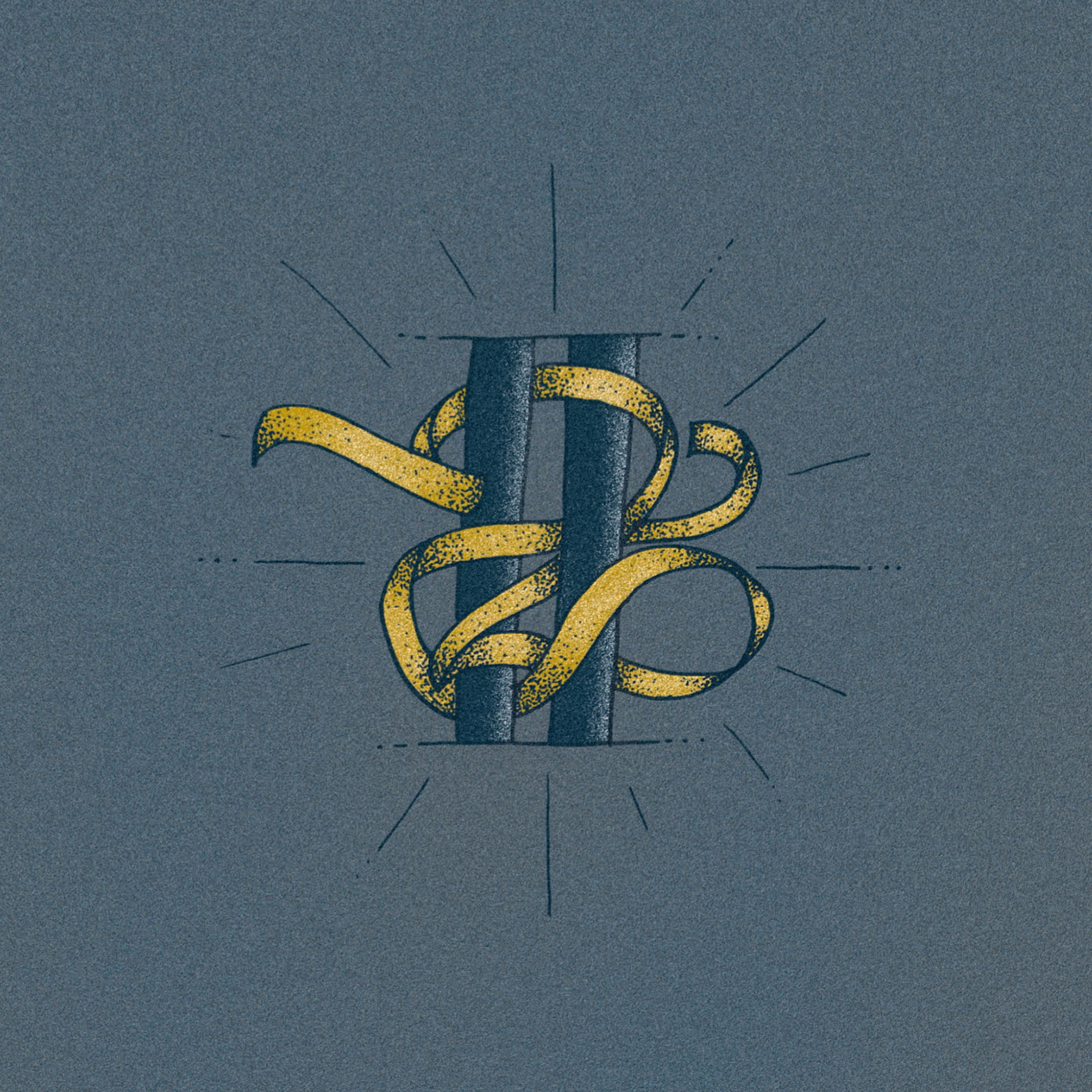
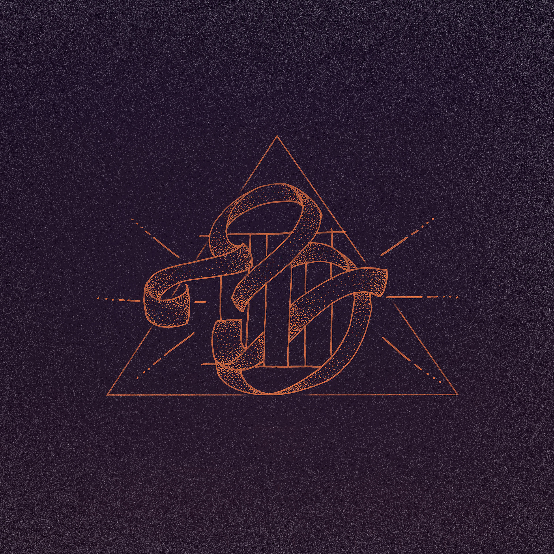
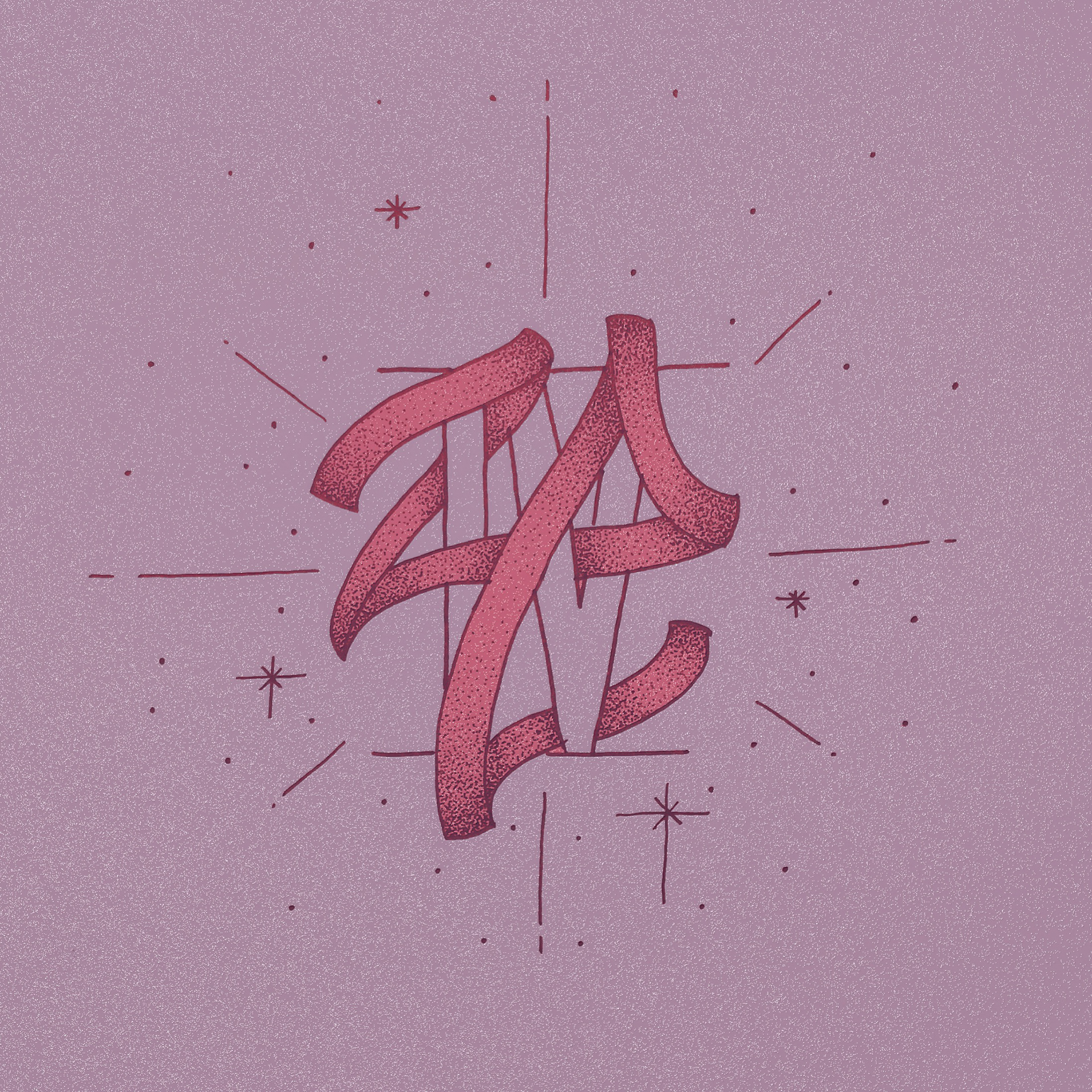
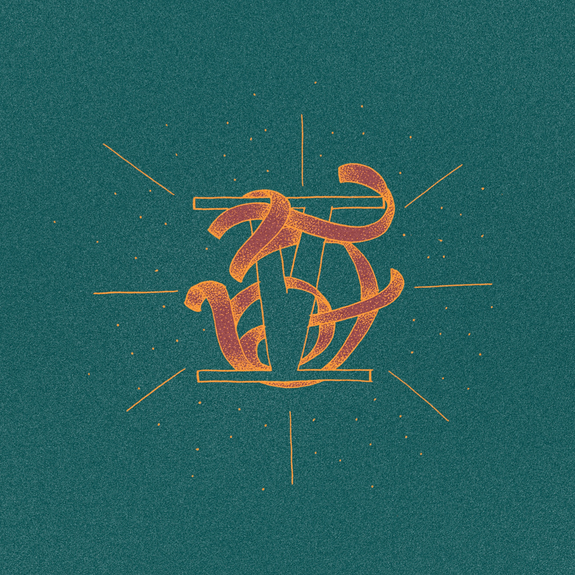
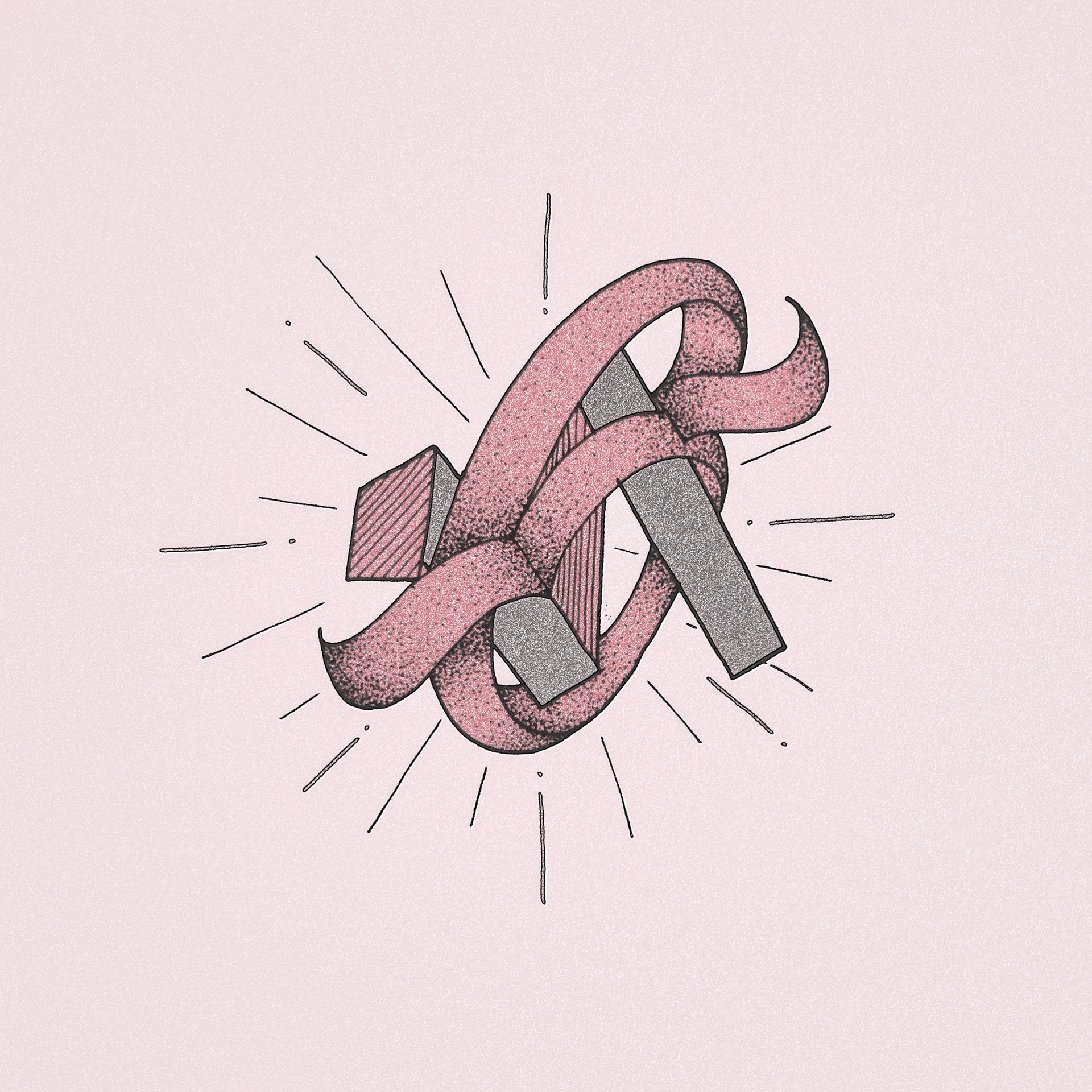
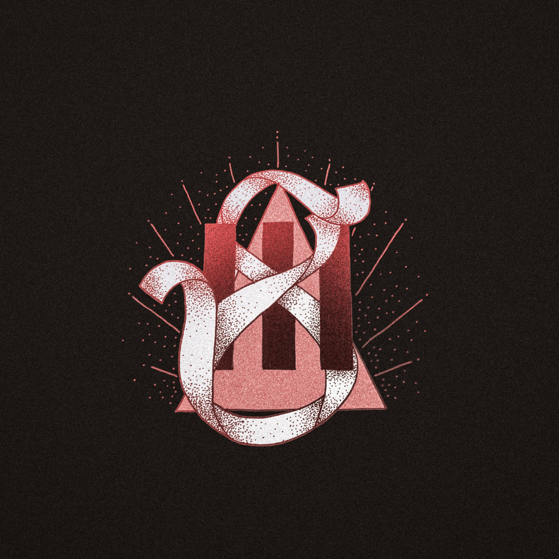
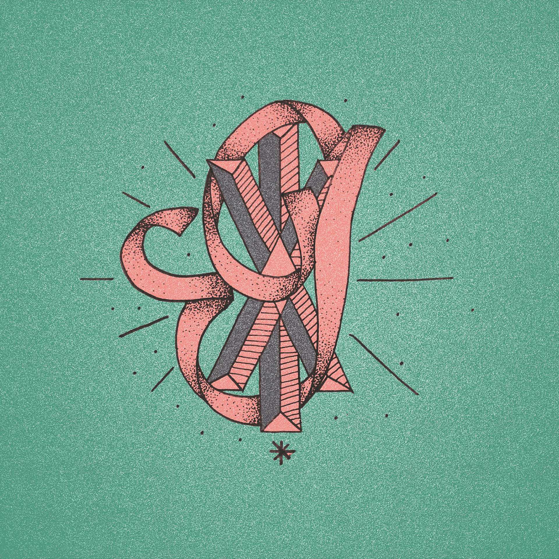
Given the time constraints of the project (1 letterform = 1 day), I realised that I needed to spend additional time finding a universe in which to express the dots. After some sketching experiments I ascertained that the ribbon-like letterforms would work best against a solid and stable shape, which in this case could be sans-serif style capitals of the letter in question, and a literal or fantasy interpretation of roman numerals for the numbers. I also found inspiration in the work of Sara Blake as well as tattoo artists who used pointillism.
Once I had found my groove, the project advanced more easily, although I am eager to apply the found style to the first few letterforms now, as the project seems incomplete otherwise.
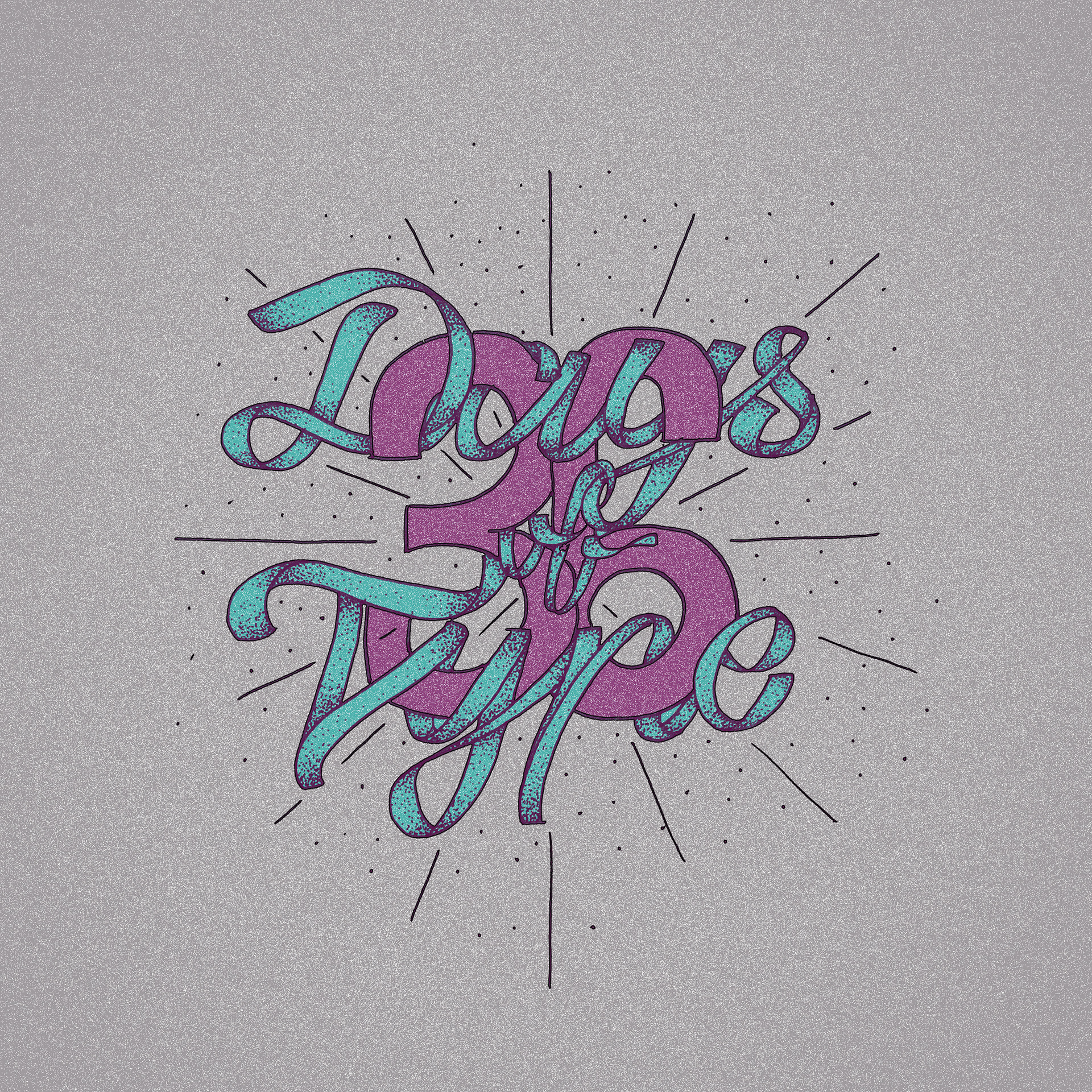


And here is the full alphabet ... All in all, the daily practice and the time constraints of the submission process have been very beneficial in kicking the creativity into gear, and I look forward to next year's edition very much!
Many thanks for having a look at my project! :)
